啊扑UP咖啡水品牌&产品包装设计
UP VITALITY SELTZER BRAND&PACKAGE DESIGN
UP VITALITY SELTZER BRAND&PACKAGE DESIGN
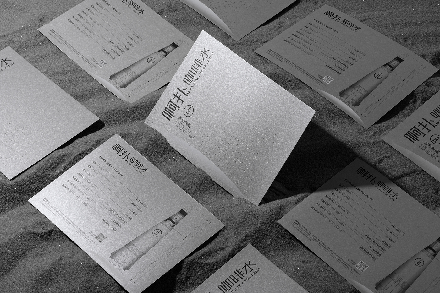
啊扑咖啡水从品牌到产品包装的整体设计以火箭作为大的标识来体现其特性。品牌LOGO设计上以品牌名UP为基础与火箭特征进行同构,顶部加入了瓶盖元素,凸显产品的饮品属性。瓶型设计上整体比例修长,瓶身为向上收缩延伸的曲线,底部用四个平均分布的助推器来让火箭的造型特征更加明确;平面部分产品名称设计为具有科技感的竖排版文字,卖点含量等信息左对齐秩序感排列,同时在瓶身背面绘制扁平切面口味插图,通过正背透叠与材料的光线折射,营造出不确定的视觉效果,整体充满独特高级之感。UP VITALITY SELTZER the overall design from branding to product packaging uses the rocket as a large logo to reflect its characteristics. The brand LOGO design is based on the brand name UP and is isomorphic with the characteristics of the rocket, and the bottle cap element is added to the top to highlight the beverage attributes of the product. The overall proportion of the bottle design is slender, the bottle body is a curve that shrinks and extends upward, and four evenly distributed boosters are used at the bottom to make the shape of the rocket more clear; the product name of the flat part is designed as a vertical type of text with a sense of technology, The information such as the content of selling points is arranged in a left-aligned sense of order. At the same time, the flat section flavor illustrations are drawn on the back of the bottle. Through the light refraction of the front and back and the material's light refraction, an uncertain visual effect is created, and the whole is full of a unique and high-level feeling.
DA:XXD DESIGN| AD:肖琪媛、徐育青 | D:肖琪媛、徐育青| C:长沙均可佰特食品科技有限公司